On July 20, 2026 I rebuilt ishikawa.co, the official hub for the six media properties I run and for my development work, from scratch.
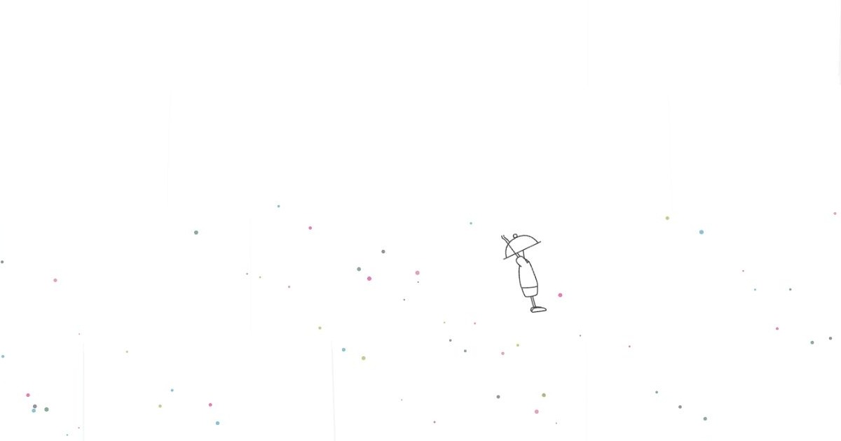
You walk right. Six media appear as six different places. It rains in the forest; past the lake you fish an article out of the water. Signals run through a dark circuit. In the travel city, memories settle as points of light. Walk through all six and the screen collapses — character and particles fall — and reassembles into a readable “Living Atlas.”
Looking at the finished thing, you might assume this was the plan. It was not. Before this, I built a fully realized 3D cyberpunk district and threw the entire concept away. I built a white line-art world, added video, prototyped walked-path trails and returning-visitor effects. Several things that worked got deleted.
This is a build log, not a launch announcement: what got made, where I stopped because something felt wrong, and why I started over.
Originally published in Japanese on July 21, 2026. This English version was written in September 2026.
The site has changed its protagonist several times
The first ishikawa.co, in 2018, was a WordPress profile-and-services site. Web production, blog, profile, contact — the obvious entry points for working independently. The protagonist was me-as-a-vendor plus an inquiry form.
In 2021 it moved to a custom PHP stack and started pulling the latest posts from my blogs over Ajax. Not just explaining myself, but showing that the properties were alive. The current hub idea starts there.
August 2025 went experimental: Canvas scenes, a warp-style navigation, terminal-flavored output, a sound toggle. The direction — the screen itself should be the experience — got explicit here.
The April 2026 version went back to fundamentals: PHP server-side rendering, with media, production work, AI music, and personal software laid out as plain readable HTML. RSS fetching, JSON caching, sub-pages, and structured data were built then. In June I reskinned it — dark background, aurora palette, parallax, cursor trails, footstep particles.
It looked good, and it was still just a nice-looking business site. Six properties sat in six identical cards, and the differences between them disappeared.
Because the protagonist is not a portfolio card. It is six actively updated media — fishing and rural life, web and AI, travel and food, Minecraft, gifts, and product comparison — plus the work of running all of them. Six identical cards erase exactly the thing that makes them different. What if each one were a place, and moving between them were itself the introduction? That question started this rebuild.
I built a walkable 3D city and scrapped the concept
In early July 2026 the first attempt was a Three.js 3D world. Buildings, signage, bloom, fog, reflections, collision, a huge video screen. A Hong-Kong-alley cyber district, with a cyber cat as the player character at one point.
As a 3D site it had most of what I wanted to try. You could walk. It glowed. It made sound. You could cut between buildings.
The problem was what the work became. The more I built, the more the project was models, lighting, camera, materials, and collision tuning. The 3D space had become the protagonist, not the media it was supposed to introduce.
Worse, unifying everything into one cyber city erased the six identities again. The forest, the travel writing, and the gift guide all read as another neon sign on the same street.
So I stopped improving the 3D version. Not optimizing it — retracting the concept. Two things survived, and both were only visible because I had built it: walking is worth keeping, and the six properties must not be pressed into one texture. I kept walking. I kept nothing else.
From white line art to pointillism generated by walking
After the 3D version, the screen went white. A character stands in an empty white world; walking extends a line from their feet; media appear as places. The early thinking was SVG line art, single-stroke drawing, 2.5D depth.
I deliberately did not build six worlds at once. I scoped down to one — the forest, rain, lake, pier, and fishing of my fishing-and-rural-life site. Multiplying before “what happens when you walk” is settled just produces six unfinished things.
Along the way the environment shifted from lines to dots. The character stays SVG line art; forest, water, circuitry, space, gifts, and product shelves are drawn as dots and particles on Canvas.
Dots turned out to have dialects. In the forest they are leaves and rain. On the lake, ripples and spray. On the tech blog they are signals running a circuit. In the Minecraft world, cubes and fireworks. On the gift site, wrapping paper. On the comparison site, shelves and selection marks.
This is not a lightweight port of the 3D version. The subject changed — from “an elaborately built space” to “points that come into existence because you walked.”
The white screen had its own problem: intended as breathing room, a long white screen reads as a stalled load. So the opening became a logo assembling out of particles, converging to a single grain, and that grain falling to become the first ripple on the ground. The logo and the world stop being separate; the first dot is the start of the journey.
Even after it looked right, the logo’s vertical position drifted between first paint and redraw. You can build a large set piece and still have a one-pixel offset expose it as a prop. That got fixed before launch too.
Six media, six places, six verbs
Act One has a simple shared grammar: walk, the scenery reacts, read the entrance to a world, press Space to discover an article, press Enter to go through to the article or the site.
Discovery, though, is not the same everywhere. On the fishing site, rain intensifies partway through the forest, pools into a lake, and you land an article off the end of the pier. That one took many passes: the lake’s dot density was too low to read as water, the water started before the pier instead of after it, and the line would hook a fish from a position that passed through the pier itself.
The tech blog is dark circuitry and signals. The travel site is journeys, cities, harbors, memory. The Minecraft log evokes the End: void, cubes, floating architecture, creeper fireworks. The gift site is wrapping. The comparison site — which reviews appliances and household goods against model numbers and specifications — is shelves, comparison, and choosing.
Each world also carries a verb: walk / ripple / fish / live, connect, capture, build, unwrap, choose. The difference is not expressed by color. It is expressed by how the sign’s emblem assembles, what shape the particles take, and what you physically do to meet an article.
I tried putting video footage into the forest world. The footage took over from the pointillism and broke the world’s grammar, so it came out. Having an asset is not a reason to use it; fitting the rules of that world is.
Trailing lines and wave particles behind the character were deleted — visual clutter, no performance benefit. Returning-visitor effects that showed your previous constellation or previous traveler were reworked: on a first encounter they just read as a question mark. Removing things that already worked was consistently harder than adding things.
Discovery, constellations, and sound as memory of the trip
Arriving somewhere is not the same as introducing it. So PHP pulls the latest posts from all six properties via RSS and makes them discoverable inside the worlds. On the fishing site you land them, matching the medium’s own action to the act of discovery.
The order in which you discover things becomes a constellation. Same six worlds, different order, different shape — and you can take it home as a travel-card image at the end.
Sound is not a BGM loop either. It is Web Audio “pointillism”: one note placed per event — a discovery, a fall, a rise. Nothing plays continuously; like the dots on screen, a sound exists only at the moment of an action. Second playthroughs, reverse playback, an awakening sequence, and a path that keeps the colors of worlds you visited came later. Many of those returning-visitor touches do not communicate without explanation, so I kept re-picking which ones survived.
Near the end, the set pieces genuinely got slow
For a while the treasure sequence and the Act One to Act Two transition looked slow. They were not slow by design. They were actually slow.
The cause: generating a large particle burst in a single frame, removing elements from the front of an array in bulk, and reconstructing objects. In my measurements the heap sawtoothed between roughly 15 MB and 31 MB, and garbage collection was perceptible as a hitch.
The fix was not simply fewer particles. Bursts were spread across multiple frames, front-of-array removal was replaced with swap-pop, a 420-slot particle pool was preallocated and reused, and the 1,400-particle ceiling stayed where it was. After that the heap sat around 16 MB and stayed nearly flat, and a re-measurement showed no frames taking longer than 6 ms.
A subtler stutter while walking had a different cause. The Canvas redrew at 30 fps, with CSS transforms interpolating between redraws — but the interpolation value only matched the near field. The far field snapped back roughly 5 px on every redraw. The ground was smooth while the distant forest shuddered thirty times a second. Splitting the dot canvas into far and near bands, each interpolated with its own parallax value, resolved it.
The step that mattered most: before fixing anything, I built an on-screen performance HUD showing frame time, JavaScript time, Canvas p95, heap, reallocations, and band values on the real device. Measuring where it stalls beats repeating the word “heavy.”
Fast JavaScript is also not the whole story. While six full-screen multiply, screen, and soft-light layers were stacked, the GPU cost stayed. Bright worlds went to zero blend layers; dark worlds were cut to two screen layers. The tech blog’s colors came out more vivid as a result.
“The ending is boring” sent me back to rebuild the ending
Originally, after the six worlds, you got a menu and links to ordinary sub-pages. Having walked that far, dropping back into a normal website is a letdown. I stopped there, on the real screen.
I considered a study, a door, a companion character. What I chose instead was to promote the server-rendered HTML I had built as the SEO fallback into Act Two: the Living Atlas.
Act One walks sideways and discovers six media. Act Two scrolls vertically through the person, the media, the open-source work, and the areas I take on. As you scroll, the character walks along a rail on the left, and sits down when you stop. Reading became Act Two’s version of walking.
Walk to the right edge of Act One and the world collapses; six colors of particles and the character fall, and the fallen particles reassemble along Act Two’s vertical axis. The same dots change role.
The entrance got rebuilt once. Space to advance did not match Act One’s “keep walking right” grammar, so it became “walk all the way right.” After entering Act Two, people kept pressing left and right because the switch to vertical scrolling did not read; W/S and arrow keys, an on-stop hint, and a “swipe” cue for touch went in.
There were real bugs here. Returning to Act One and being unable to re-enter. Pressing “back to the world” mid-transition leaving the input lock stuck. The fix was to make both acts temporarily uninteractive during a transition and centralize the release on completion, abort, and Escape — with a regression test that fires a click and a Space at the 58% mark of the transition. One line of invisible state can lock the deepest part of the experience.
Another: collecting missed discoveries afterwards would not open the portal, because completion was only evaluated at the final location. That became a pure function re-evaluated on every discovery, with tests.
Mobile was not a shrunken desktop
At 390 px the document width came out at 1080 px. Signs overlapped the character. The scroll hint covered a heading. On a return visit the travel card and the sound button collided. Keyboard hints written for desktop showed up on touch screens.
The Living Atlas was rebuilt as a single column, signs were clamped into the viewport, and touch left/right buttons and matching copy were added. QA covered not only first paint but the post-playthrough return state as a separate scenario.
The character got priority over the background. The crouch before a jump was too small. A single oversized frame appeared after landing. Walking after a discovery or after idling produced a fine vertical jitter. A fall read as floating upward. The character is the experience’s unit of scale, so dedicated poses — fall, brace, launch, land, sit — were added, with state transitions and sizes covered by regression tests.
On sub-pages, a heading broke mid-word and a two-character fragment of the closing section fell to its own line. With the large set pieces already finished, these typographic details were still treated as high-priority pre-launch fixes.
It looks like a game; underneath it is meaningful HTML
ishikawa.co runs on PHP 8.4 server-side rendering and vanilla JavaScript. No UI framework, no production build step.
Canvas 2D draws the point clouds, water, rain, spray, circuitry, and space. The character, links, articles, controls, and everything needed for accessibility are DOM and SVG. PHP handles RSS retrieval for the six properties, JSON caching, body content, and structured data.
The important part: there is no separate hidden body of text for search engines or AI. The meaningful server HTML built for the April 2026 version is still there, and that same DOM is what becomes the Living Atlas when JavaScript is enabled. If JavaScript fails, the headings and links for the person, media, open-source work, and services are simply readable.
Title and description cover the six media, open-source releases, website and system development, SEO/LLMO, applied AI, and article production. Person, WebSite, Media, SoftwareSourceCode, and Service structured data are wired up, alongside a projects page, sitemap, robots, and llms.txt. Under reduced motion the large set pieces stop without losing information or controls. RSS is fetched and cached server-side, so browsing does not hammer six sites.
The discoverability work is not bolted on behind a game. Both acts sit on top of a semantic structure that reads normally.
Built with AI; the “stop, that feels wrong” calls stayed mine
I decided the purpose of the experience, the direction of each world, what felt wrong, the priorities, and whether to publish. I walked it in real Chrome and stopped things concretely: “this is slow,” “that looks like it is floating,” “the ending is boring,” “you are jumping to a conclusion.”
Codex read the existing code and specification and handled implementation, regression tests, performance measurement, pre-launch QA, and the deployment procedure. Claude did independent review, organized the direction of the visual language, decomposed hypotheses about performance causes, proposed Act Two, and helped with pre-launch QA. A producer role kept business coherence for the hub, SEO/LLMO, outside-perspective problems, and the go/no-go call.
None of that adds up to several AIs going off and building a website on their own.
AI made a large number of attempts possible. But deciding not to ship the 3D city, the video, the over-strong particles, and the ordinary menu happened after seeing something wrong on a real screen and putting it into words.
One near-miss is worth recording. A diagonal white band appeared across the whole screen, and I nearly localized it to the tree particles alone. Interpreting a visible symptom too narrowly produces a misdiagnosis with AI just as it does without. Pulling back to “this is not only about the trees” and re-examining the whole render pipeline was what found it.
Implementer, direction-stopper, and independent reviewer as separate roles. Without that separation, “we built something that runs” and “we built something worth publishing” would have blurred into each other.
Seventy-six regression tests and the deploy are part of the build
Before launch I re-ran 76 Node regression tests and 6 PHP test files. Main QA confirmed zero console errors, zero horizontal overflow, and both desktop and 390 px; independent QA confirmed zero launch-blocking issues.
GitHub Actions runs PHP validation, Node tests, artifact generation, an FTPS dry run, the production sync, a release-marker check, and an HTTP smoke test, in that order. Leftover production assets, samples, movie files, and legacy code were removed from what gets published — only what the current experience needs goes to the server.
The current version went to production at 17:46 on July 20, 2026.
Publishing is not the end. When the six properties update, the articles you discover in the worlds change. Browsers, devices, and return states will surface things I have not seen yet. So what I built is less a finished product than an official site I can keep observing and correcting.
Behind a walkable world are the screens you threw away
This version of ishikawa.co is what remained after building a 3D cyber district and retracting it, turning white line art into pointillism, and making six media into six places. You discover articles, you form a constellation, sound is placed one grain at a time. The ending being a plain menu was unacceptable, so Act One’s world collapses into Act Two’s Living Atlas.
Along the way: performance regressions, state management, input contention, mobile horizontal overflow, a jittering character, and a single character of text falling to the wrong line. Redo after redo, large and small.
AI multiplied the number of attempts and carried implementation and verification. What remained human was stopping the things that felt wrong on the real screen, and deciding what the protagonist was.
Walking was never the goal. The question was how to present six media, and the work of moving between them, as one official site. This world is my answer to that as of July 2026.